
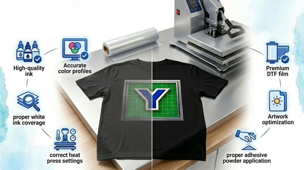
How to Make DTF Transfers More Vibrant: 7 Proven Methods
Nothing is more frustrating than creating a design that looks incredible on your computer screen, only to see dull, faded colors appear after printing. Color vibrancy is one of the biggest factors customers notice when evaluating custom apparel.
Fortunately, learning How to Make DTF Transfers More Vibrant is easier than most decorators realize.
In many cases, dull prints are caused by a few small issues that can be corrected quickly. Everything from image resolution and white ink quality to heat press settings and color profiles can impact your final result.
Whether you’re a beginner starting a small business or an experienced production shop looking to improve consistency, optimizing your workflow can dramatically improve print quality.
These seven proven methods will help you create brighter, more professional apparel that customers love wearing.
Why DTF Colors Sometimes Look Dull
Before fixing the problem, it’s important to understand the cause.
Several factors can reduce vibrancy:
- Low-resolution artwork
- Poor white ink circulation
- Incorrect color profiles
- Inferior film quality
- Inconsistent heat press settings
- Poor adhesive powder application
Identifying the root cause is the first step in learning How to Make DTF Transfers More Vibrant.
1. Use High-Resolution Artwork
The printing process can only reproduce what exists in the original design.
Always use artwork that is:
- 300 DPI minimum
- PNG format with transparent backgrounds
- Properly color corrected
Avoid:
- Screenshots
- Compressed images
- Low-resolution internet graphics
Better files produce better colors.
2. Maintain White Ink Properly
White ink acts as the foundation for vibrant colors.
Poorly maintained white ink often causes:
- Faded colors
- Inconsistent opacity
- Uneven prints
White Ink Maintenance Tips
- Shake bottles daily
- Agitate printer systems regularly
- Perform nozzle checks
- Clean print heads consistently
White ink health directly impacts vibrancy.
3. Use Quality DTF Film
Film quality influences color performance more than many beginners realize.
Premium film offers:
- Better ink absorption
- Improved color retention
- Consistent transfer quality
Low-quality film may create:
- Washed-out colors
- Uneven textures
- Reduced durability
This is a major factor when learning How to Make DTF Transfers More Vibrant.
4. Optimize Your Color Profiles
Color management is one of the biggest opportunities for improvement.
Use proper ICC profiles designed for:
- Your printer
- Your ink brand
- Your RIP software
Avoid generic settings.
Every machine setup is different.
Consistent calibration creates predictable results.
5. Apply Adhesive Powder Evenly
Adhesive powder impacts more than durability.
Uneven application can affect:
- Color appearance
- Surface texture
- Print consistency
Best Practices
Apply enough powder to fully cover the printed image.
Remove excess powder before curing.
Avoid clumping.
Proper powder distribution creates cleaner results.
6. Perfect Your Heat Press Settings
Heat settings influence final color appearance.
Incorrect temperatures may cause:
- Dull finishes
- Overcured prints
- Adhesion issues
Recommended starting points:
- Temperature: 300°F–325°F
- Pressure: Medium to firm
- Press time: 10–15 seconds
Always perform test presses.
Many decorators improve their results simply by adjusting these variables.
7. Build a Consistent Production Workflow
Consistency produces vibrancy.
Create standard operating procedures for:
- Artwork preparation
- Printer maintenance
- Film selection
- Powder application
- Heat pressing
Repeatable systems reduce variables.
This is often the biggest difference between hobbyists and professional businesses.
Learning How to Make DTF Transfers More Vibrant ultimately comes down to controlling your entire workflow.
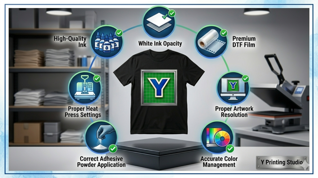
Quick Vibrancy Checklist
Use this checklist before every production run.
✅ High-resolution artwork
✅ Healthy white ink circulation
✅ Premium DTF film
✅ Correct ICC profiles
✅ Even adhesive powder
✅ Proper heat press settings
✅ Consistent workflow
Small improvements add up quickly.
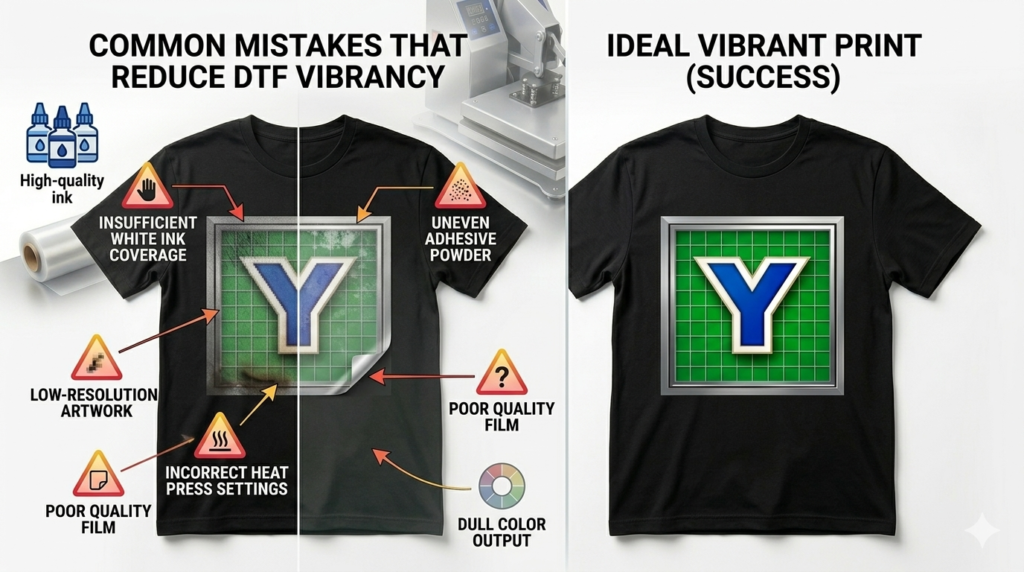
Common Mistakes That Reduce Color Vibrancy
Avoid these common errors:
❌ Using low-resolution artwork
❌ Ignoring white ink maintenance
❌ Buying cheap film
❌ Skipping printer calibration
❌ Uneven adhesive powder
❌ Guessing heat press settings
These mistakes often create disappointing results.
Correcting them dramatically improves output quality.
Create a Complete DTF Ecosystem
No single product determines vibrancy.
Professional results come from a complete system.
Your production process should include:
- Premium DTF film
- Reliable transfers
- High-quality inks
- Consistent adhesive powder
- Proper maintenance schedules
Businesses that standardize every step achieve better long-term results.
At Y Printing, we emphasize systems over shortcuts because consistency builds customer trust.
RELATED Y PRINTING RESOURCES
- Browse our DTF Transfers collection for ready-to-press designs.
- Explore our DTF Film Products for better color retention.
- Read our DTF Ink Guide to improve print consistency.
- Learn from our Polyamide Powder Guide for stronger adhesion.
- Discover more About Us and our expertise in custom apparel.
- Scale your business with Custom Printing Solutions.
INDUSTRY REFERENCES
Helpful educational resources:
CONCLUSION
Learning How to Make DTF Transfers More Vibrant is not about finding a single secret trick. It’s about optimizing every stage of your production process.
Small improvements to artwork quality, white ink maintenance, film selection, color profiles, and heat press settings can dramatically transform your final product.
The businesses that consistently create vibrant apparel are the ones that focus on repeatable systems rather than quick fixes.
At Y Printing, we believe professional results come from quality supplies, proven processes, and attention to detail.
Use these seven proven methods to boost color vibrancy, reduce wasted materials, and create apparel your customers will proudly wear.
FREQUENTLY ASKED QUESTIONS
Why do my DTF transfers look dull?
Dull prints are often caused by poor artwork quality, weak white ink coverage, incorrect color profiles, or poor heat press settings.
Does white ink affect color vibrancy?
Yes. White ink creates the foundation that allows colors to appear bright and bold.
Does DTF film quality matter?
Absolutely. Premium film provides better color retention and consistency.
What heat press settings help improve colors?
Most DTF transfers perform well at 300°F–325°F for 10–15 seconds with medium to firm pressure.
How do professionals make DTF transfers more vibrant?
They standardize every step of production, including artwork preparation, printer maintenance, film quality, and heat press settings.